Data entry is the process of entering your collected data into a spreadsheet. The data entry page looks and functions like a standard spreadsheet application. There are currently two methods for data entry, manual entry and uploading a file.
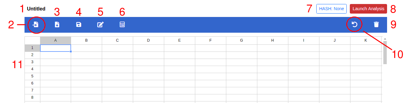
Above is the data entry table layout used in GoFactr. There are currently 10 action buttons labeled in red in the above image. Detail about specific actions are further described in each section:
Table Name
Click on the text to change the name of the dataset. This name is used as the filename when saving the table to a CSV file.
Import File Button
Click this button to import a file from local disk. The preferred format of the file is explained in the FAQ
Save Table Button
Click on this button to save table contents as a csv file on your computer/tablet. The default filename is the dataset name but can be changed.
Save Dataset Button
Click on this button when you want to save the data temporarily in memory. This is useful to prevent against accidental page navigations away from the data entry page. Ctrl-S will also perform the same action. Automatic saves also occur roughly every minute.
Rename Headers Button
Click this button to change the labels defining the columns in the data table. The headers are automatically populated if the data is loaded from a CSV file.
When doing manual entry, remember to label each column.
Apply Formula Button
The formula button allows one to create new variables from existing variables using simple mathematical functions.
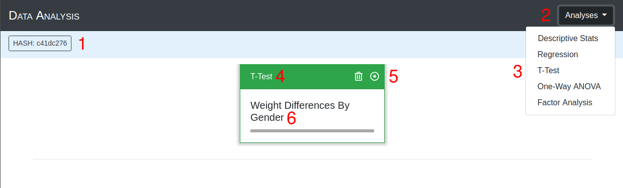
Hash Number
A random number used to match the data table with the analysis page.
Launch Analysis Button
Button to launch the analysis page to perform statistical tests. A red button signifies that the data in the table has no associated analysis page. When pressed and launched successfully, the button turns to green and the Hash value is updated.
Delete Table Button
Press this button to delete and clear the table contents. A dialog box will appear to make sure you want to do this before contents are deleted.
Undo Action
Pressing this button will undo the last action performed. Ctrl-Z also performs the same action.
Data Entry Area
The area where data is entered and manipulated.
When using a mouse, right-clicking in the data entry area brings up a menu of useful actions.
Manual Entry
Manual entry involes inputting data through the keyboard or touch interface. The basic steps used to manually enter data are outlined below.
Update Table Name
Select the table name box and enter a name for the table.
Enter Header Information
Click on the Rename Headers button on the top bar. A pop-up window will display two options for column header input. The multiple option tab allows entry of several header names at once, while the single option allows renaming of individual headers. After renaming each header, press the Apply button to accept changes.
Enter data in the spreadsheet
Using the keyboard or touch interface, select the cell and enter the data.
On touch screens, look for the number pad button in the lower right to corner to bring up 10-key pad for data entry.
Press the Launch Analysis Button
This will open a window to perform various significance tests. See Analysis section.
Load Data from File
An alternative method to populate the data entry table is to import data from a file. The preferred file type is a comma seperated file (CSV) but GoFactr also provides basic support for .XLSX and .ODS. GoFactr requires files be written in a specific way, please see the FAQ for the correct format.
Click the Load File Button,
This will bring up a file selection window. Choose the appropriate file and press open.
Make any necessary changes
After the data has loaded, which may take awhile for large datasets, it will populate and display the spreadsheet. The spreadsheet is editable if any changes are necessary.
Save the changes (optional)
Save the data entry table if desired.
Press the Launch Analysis Button
This will open a new window where analysis of the data can begin. See Analysis section.
Download Table as CSV
To download data to your local computer for future use, press the save table to CSV button. This will open a dialog box to enter a filename for your csv file. It is recommended when doing Manual Entry or making changes to an uploaded file to save the data before analysis.
Click the Save table to CSV Button,
This will bring up the save input window. Choose the default filename or enter a new one.
Change the desired filename (optional)
Update the desired output filename to reflect any revisions, progress, etc.
Press the Save Button
The browser will automatically create a CSV file and download it. This file can be used with Load data from File for future analysis.
Renaming Column Headers
Naming the column headers is important for identification in later analysis, plots, and table creation: use intuitive, descriptive names that make sense. There are three options to set/update the headers.
Click the Rename Headers Button,
A file input window will open with options to select changing a single header, multiple headers, or using a row from the spreadsheet.
Select Single, Multiple, or Swap Row input types
Use single selection to change a specific header name. Choose the header to change from the drop down menu and use the input box to update the name.
Use multiple selection to set a group of header names simultaneously, this is useful when cutting and pasting from another file. Enter the desired header names in the text area separated by commas (,).
Use swap row selection to set the header names from a row in the data entry table. A preview of the first two entries from the selected row are populated to verify the correct row was selected.
Press the Apply Button
It is important to press the Apply Button after every update.
Formula Editor
The formula editor allows new variables to be created from the existing variables. This is useful for reverse scoring Likert data, creating a composite score from a set of survey items, or applying a general transformation to entire column of data.
Click the Apply Formula Button,
A new display will open with a calculator, formula box, and variable names.
Set the new output variable name
Enter the name of the new desired variable name; descriptive names are better. If no name is specified the next available letter in the table is used.
Enter the desired formula
Using the mouse or touch interface, select the operators from the calculator and variables from the selection box. PEMDAS order of operations apply.
Press the compute button
A new column with the computed values should automatically populate the data entry table.
Starting Data Analysis
When data entry is complete, the next step is to launch the Data Analysis window by pressing the Launch Analysis button. A new tab or window will open with analysis options.
It is important that the HASH on the Data Entry page and the HASH on the Data Analysis Page are the same and the Launch Analysis button is green.
This ensures the data from the spreadsheet is the same data used during analysis. If the Launch Analysis button appears red, or the hashes do not match, then simply press the Launch Analysis button again. It can be pressed at any time, even if it is green.
Save data to CSV (optional)
If the data was manually entered or changes to the data were made after loading from a csv file, it is strongly recommended to save the file.
Click the Launch Analysis Button
A new tab or window should open. Inspect the hash on the new window to make sure it matches the HASH in the Data Entry page.
Perform the appropriate tests on the data
Click on the Analyses drop down menu and select the appropriate analysis. For more information about the different types of supported analyses, see the Analyses section.
Analyses
GoFactr currently provides 6 statistical tests commonly used in data analysis. Descriptions about each test, when to use each, and how to run each are outlined below. The Data Analysis page is only accessible after the Launch Analysis button has been pressed.
Hash Number
A random number used to match the data analysis with the data entry page.
Analyses Button
Press this button to access the list of available statistical tests.
Statistical Test Selection
A dropdown menu where the selection of the desired statistical test is made.
Results Card
After the statistical test is initiated, a results card is added to the page. The name of the test is listed at the top of the card.
Results Access
Opens the card and displays the results of the test if possible.
Deletes the card from the window.
Card Title
Short title describing the analysis performed, this is editable only during the initialization of the test.
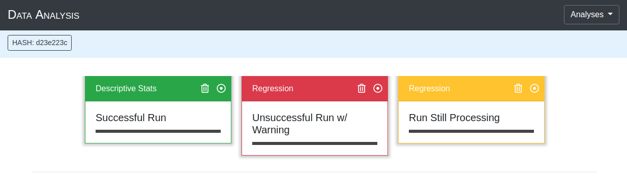
Results Card Descriptions
Once the results card is added to the page, it's external color conveys information about the processing state.
The results of the processing were successful. Opening the card will display the results for interpretation.
The processing is currently still running. The results card cannot be opened.
The results of the processing has failed. Opening the card will show text explaining why an error occured.
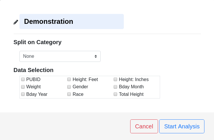
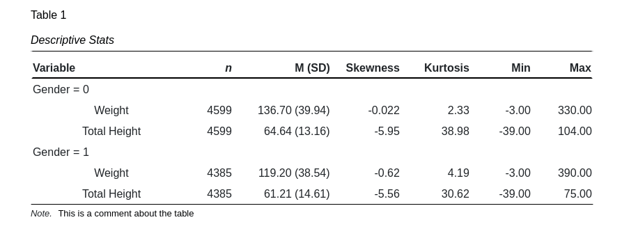
Descriptive Statistics
When to Use
Run Descriptive Statistics to gain information about the composition of the collected data such as mean, standard deviation, minimum and maximum values. This information is useful when assessing the presence of extreme values in the data or if the data is approximately normally distributed.
How to Run
Press Analyses Button on the Data Analysis page.
Select Descriptive Stats from drop down menu.
Choose the desired variables.
Checked boxes indicate the variable has been selected.
Press the Start Analysis button.
Open the results card to view output.
Descriptive Stats Options
Split on Category
A category variable that defines separate groups within the data. This is often male/female distinction or other identifiers such as 1st, 2nd and 3rd. Selecting an option other than None will result in reporting of statistics for each unique group.
Data Selection
The variables that are included in the calculation of descriptive statistics.
Interpreting Results
A tabulation of the results is presented when the descriptive statistics results card is opened. The Table Number, Title and Notes fields are all editable.
Sample Size: n
The sample size is the number of individual cases found for each variable.
Mean: M
The mean is a measure of central tendency representing the average value of the group.
Standard Deviation: (SD)
The standard deviation is a measure of dispersion or width about the mean. It provides information about how clustered the data is.
Skewness: Skewness
The Skewness is a measure of symmetry about the mean. A postive skewness, sometimes called right-skewed, indicates a higher probability of occurence to the right of the mean relative to the normal distribution. A negative skewness, sometimes called left-skewed, indicates a higher probability of occurence to the left of the mean.
Kurtosis: Kurtosis
The Kurtosis is a measure of 'peakedness' of the mean. The kurtosis of a normal distribution is 3. Values greater than 3 indicate a taller, narrower peak and fatter tails relative to the normal distribution. Values less than 3 have a shorter, broader peak and thinner tails.
Minimum: Min
The minimum is the lowest value in the dataset.
Maximum: Max
The maximum is the highest value in the dataset.
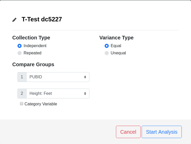
T-Test
When to Use
Use a T-Test to determine if two separate groups are equivalent. This is useful when:
Comparing a control group to an experimental group.
Assessing if a manipulation within-groups was successful.
Determining differences based on quasi-independent variables, such as biological sex.
This list is not exhaustive, but serves as an aide to the type of questions T-Tests can answer.
How to Run
Press Analyses Button on the Data Analysis page.
Select T-Test from drop down menu.
Choose the desired variables and options.
Press the Start Analysis button.
Open the results card to view output.
T-Test Options
Collection Type
Independent (default)
Select this option if the two groups do not share any members. This is the default case in many experiments when comparing a control group to an experimental group, for instance, a placebo group to a treatment group.
Repeated
Select this option if the members in each group are the same. This is often done when comparing a group before and after a manipulation, for instance, measuring the effects of watching kittens on feelings of happiness.
Variance Type
Equal (default)
Select this option if it is known the two groups have equivalent variances. When selected, Student's T-Test is used to determine the results.
Unequal
Select this option if it is known the two groups do not have equivalent variances or the equivalence of the variance is unknown. When selected, Welch's T-Test is used to determine the results.
In the creator's opinion, Unequal should be the default selection. To conform with community practices, however, Equal is set as the default. When in doubt, select Unequal.
Compare Groups
Group 1
This represents one of the two groups to be compared. A drop down menu provides an opportunity to select one of the variables from the Data Entry page. If the groups consist of a measurement variable (e.g. weight) and a category variable (e.g. gender), the measurement variable should be allocated to Group 1, as shown in the above GIF.
Group 2
Similar to Group 1, this represents a group in the comparison. If the groups consist of a measurement variable (e.g. weight) and a category variable (e.g. gender), the category variable should be allocated to Group 2 and the box indicating such should be checked, as shown in the above GIF. If Group 2 is also a measurement variable, then the box should remain unchecked.
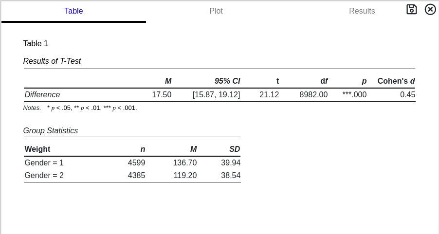
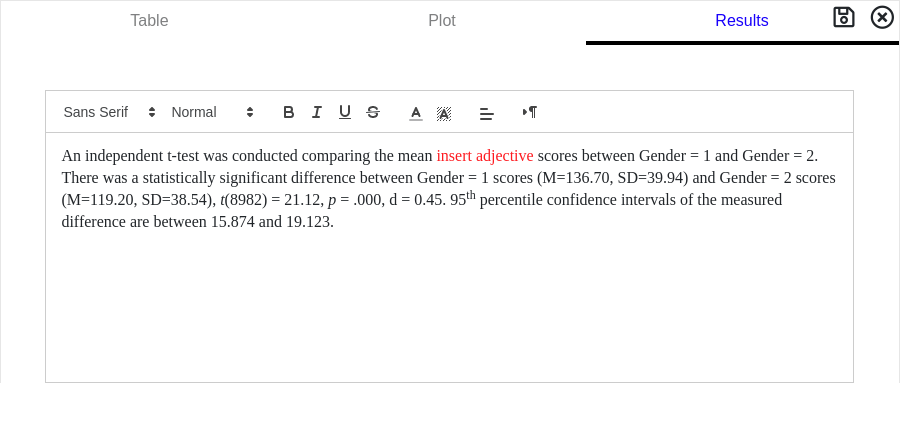
Interpreting Results
A tabulation of the results is presented when the T-Test results card is opened. The Table Number, Title and Notes fields are all editable. The first table provides results from hypothesis testing. The second table provides descriptive statistics about the two groups.
Mean: M
The mean is the average difference between the two groups.
95th Percentile Confidence Interval: 95% CI
The confidence interval represents a measure of certainty in regards to the mean. If the experiment was performed multiple times, over and over, 95% of the measured means would fall between the stated values. If the confidence interval contains '0', i.e. no difference, then the possibility that the two groups are the same cannot be rejected.
T-statistic: t
The t-statistic is the mean divided by the standard error and is analagous in many ways to a Z-Score. This number can be either positive or negative depending on if Group 1 is larger or smaller than Group 2. In general, the larger the absolute value of the t-statistic, the more likely the two groups can be differentiated.
Degrees of Freedom: d.f.
Degrees of freedom are the number of independent values available. This number also defines the shape of the t-distribution.
Probability: p
Probability, or p-value, is the likelihood of measuring the t-statistic given the degrees of freedom. When compared to a critical value, α, statistical significance can be determined.
A p-value greater than the critical value, α, DOES NOT MEAN no effect is present. It means the rejection of no effect cannot be made with any certainty or, alternatively, any effects measured cannot be distinguished from random chance.
Cohen's d: Cohen's d
Cohen's d is an indicator of effect size, measured in units of standard deviation. It provides information about the strength of the measured effects, where larger absolute values of Cohen's d suggest stronger effects. The pooled variance is used when equal variance is selected. The average variance is used when unequal variance is selected. Below is general rule of thumb for classifying effect size strength.
Effect Size
Small
0.2 - 0.5
Medium
0.5 - 0.8
Large
> 0.8
The group statistics table conveys descriptive information about the two measured groups. It is located below the T-Test table. The first column displays the name of the two groups measured or, if specified, the categorical variable value.
Number of Measurements: n
The number of measurements in each group.
Mean: M
The average value of each group.
Standard Deviation: SD
The standard deviation of each group.
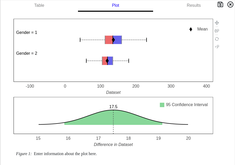
T-Test Graph
A graphical represention of the data is shown when the Plot tab is selected from the results card. Two whisker-plots and 95th percentile confidence intervals for the difference are generated. Press the save button in the top right corner to download a image (.png) file.
T-Test Description
A written description of the T-Tests results are shown when the Results tab is selected from the results card. An editable text box conveys the descriptive and inferential statistics commonly used to write up the results in a paper.
The names of the two groups or categories are generic and need to be updated. A red text describing the outcome must be updated to provide better context.
Analysis Of Variance
When to Use
Analysis of Variance (ANOVA) is used to determine if two or more groups are different. This is useful when:
Comparing a control group to multiple experimental groups.
Assessing if multiple manipulations within-groups were successful.
Determining measurement differences based on quasi-independent variables, such as political affiliation or year of birth.
This list is not exhaustive, but serves as an aide to the type of questions ANOVA can answer.
When there are only two groups in ANOVA the results are equivalent to a T-Test, where the F-statistic is equal to the t-statistic squared.
How to Run
Press Analyses Button on the Data Analysis page.
Select ANOVA from drop down menu.
Choose the desired variables and options.
Press the Start Analysis button.
Open the results card to view output.
ANOVA Options
Collection Type
Independent (default)
Select this option if the groups do not share any members. This is the default case in many experiments when comparing a control group to multiple experimental groups, for instance, a placebo group, a treatment group, and a non-treatment group.
Repeated
Select this option if the members in each group are the same. This is often done when comparing a group before and after several manipulations, for instance, measuring the effects of watching kittens and then playing with puppies on feelings of happiness.
Variance Type
Equal (default)
Select this option if it is known the groups have equivalent variances. When selected, standard ANOVA is used to determine the results.
Unequal
Select this option if it is known the groups do not have equivalent variances or the equivalence of the variance is unknown. When selected, Welch's ANOVA is used to determine the results.
In the creator's opinion, Unequal should be the default selection. To conform with community practices, however, Equal is set as the default. When in doubt, select Unequal.
Compare Groups
With Category
Use this option when there is one measurement variable for all groups and a category variable defining group membership. In the above GIF, the measurement variable is weight and the category variable is birth year.
By Groups
Use this option if each group was entered as a separate column on the Data Entry page. Do not use a category variable with this option. Select the groups to be included in the analysis by marking its associated checkbox.
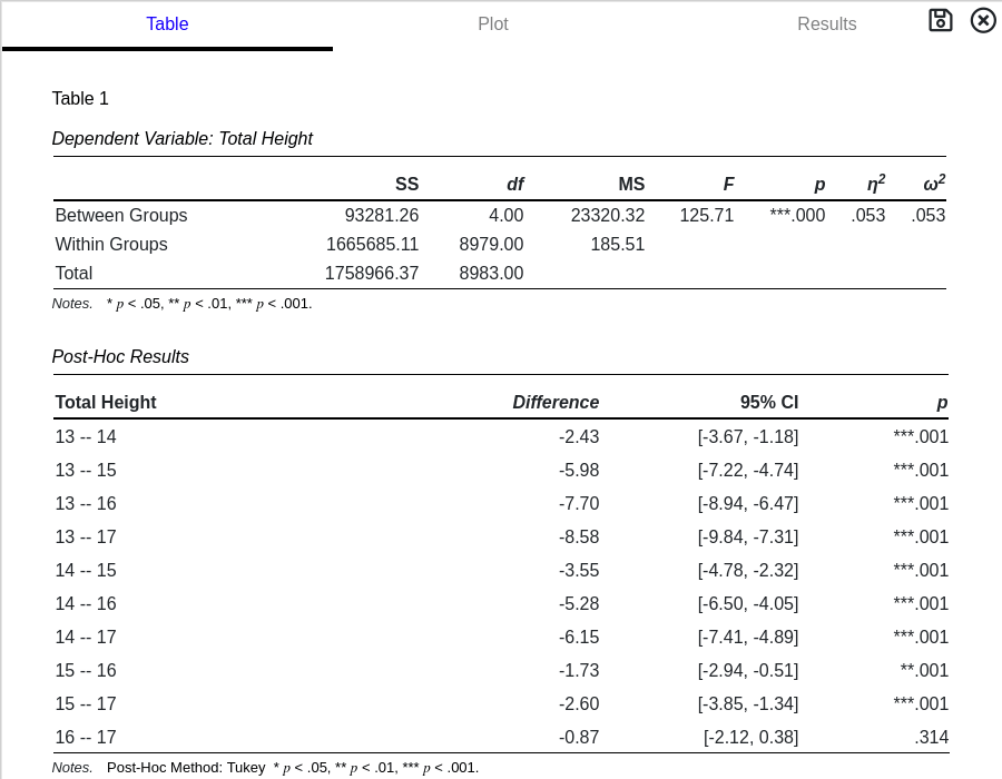
Interpreting Results
A tabulation of the results is presented when the ANOVA results card is opened. The Table Number, Title and Notes fields are all editable. The first table provides results for hypothesis testing.
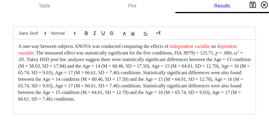
ANOVA provides information about macroscopic level differences. A statistically significant difference only suggests that at least one group is different, it does not identify which two groups are different. The second table provides information about post-hoc tests, which perform T-Tests while controlling for significance inflation.
Sum of Squares: SS
The sum of squares is the summation of the squared deviation about the partitioned mean. It is useful in determining the percentage of variance attributable to differences (between) and variance attributable to error (within).
Degrees of Freedom: d.f.
Degrees of freedom are the number of independent values in the variance computation. This number also contributes to the shape of the F-distribution.
Mean Squared Error: MS
Mean squared error is equivalent to the sum of squares divided by the degrees of freedom. It represents a variance estimate for differences (between) and errors (within).
F-statistic: F
The F-statistic is the ratio of between and within group variances. A larger number is associated with a higher probability that a difference is present.
Probability: p
The probability of measuring the F-statistic given the degrees of freedom. When compared to a critical value, α, statistical significance can be determined.
A p-value greater than the critical value, α, DOES NOT MEAN no effect is present. It means the rejection of no effect cannot be made with any certainty or, alternatively, any effects measured cannot be distinguished from random chance.
Eta-Squared: η2
Eta-squared is an indicator of effect size providing information about how much variance is attributable to the manipulation. Eta-squared always falls between 0 and 1 inclusive and a higher number suggests a larger impact due to the manipulation. It is computed as the ratio of the between sum of squares divided by the total sum of squares.
Omega-Squared: ω2
Omega-squared is an alternative effect size measurement. It provides similar information as eta-squared but partially adjusts for bias. Omega-squared should fall between 0 and 1 inclusive and a higher number suggests a larger impact due to the manipulation. If a negative value is reported, it should be interpreted as 0. Omega-squared is not valid for repeated collection types.
Effect Size
Small
0.01 - 0.06
Medium
0.06 - 0.14
Large
> 0.14
The second table provides information about post-hoc tests. Post-hoc tests will determine where differences in the groups occur.
Difference: Difference
The average difference between the means of two groups.
95th Percentile Confidence Interval: 95% CI
The confidence interval represents a measure of certainty in regards to the difference. If the experiment was performed multiple times, over and over, 95% of the measured means would fall between the stated values. If the confidence interval contains '0', i.e. no difference, then the possibility that the two groups are the same cannot be rejected.
Probability: p
The probability of measuring the t-statistic given the degrees of freedom. When compared to a critical value, α, statistical significance can be determined.
A p-value greater than the critical value, α, DOES NOT MEAN no effect is present. It means the rejection of no effect cannot be made with any certainty or, alternatively, any effects measured cannot be distinguished from random chance.
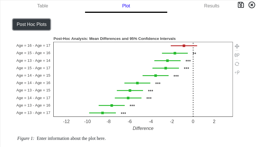
ANOVA Graphs
Two graphical representations for ANOVA are available when the Plot tab is selected from the results card.
The default graph is box-whisker plot visually representing the descriptive statistics for each group in the ANOVA.
Pressing the Post-Hoc Plots button toggles the post-hoc graph. Each combination of two groups are plotted for easier identification of significant pairs. Pairs where significant differences were found are plotted in green with asterics indicating the p-value. Pairs plotted in red indicate non-significant results.
ANOVA Description
A written description of the ANOVA results are shown when the Results tab is selected from the results card. An editable text box conveys the descriptive and inferential statistics commonly used to write up the results in a paper. Post-Hoc analysis are also included but should be rewritten to convey the exact information in a more concise manner.
The independent and dependent variables need to be updated when ANOVA is performed without a category variable. Replace the red text to reflect the appropriate information.
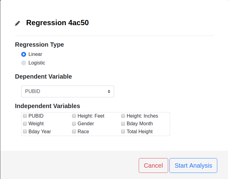
Regression
When to Use
Regression is used to determine a relationship between one or more independent (predictor) variables and a dependent (outcome) variable.
Though it may be tempting to attribute a causal relationship after performing a regression analysis, causal claims can only be made from experimental design, not statistical analyses.
How To Run
Press Analyses Button on the Data Analysis page.
Select Regression from drop down menu.
Select the type of regression, Linear or Logistic.
Choose the Dependent and Independent variables.
Press the Start Analysis button.
Open the results card to view output.
Regression Options
Regression Type
Linear (default)
Use linear regression if the dependent variable is a continuous measurement, such as weight, height, IQ, etc ...
Logistic
Use logistic regression if the dependent variable is a dichotomous measurement, such as pass/fail options on a test, predicting smoker/non-smoker, etc ...
Dependent Variable
The dependent (outcome) variable is predicted by, or depends on, the independent variable(s). The dependent variable should be continuous for linear regression and dichotomous for logistic regression.
Independent Variables
The independent (predictor) variable(s) are used to explain/predict the dependent variable. Select the variables included in the analysis by checking the appropriate boxes.
Regression currently only supports continuous, also refered to as interval/ratio, independent variables.
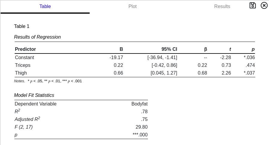
Interpreting Results
A tabulation of the results is presented when the Regression card is opened. The Table Number, Title and Notes fields are all editable. Linear and Logistic regression report different items and both are described below.
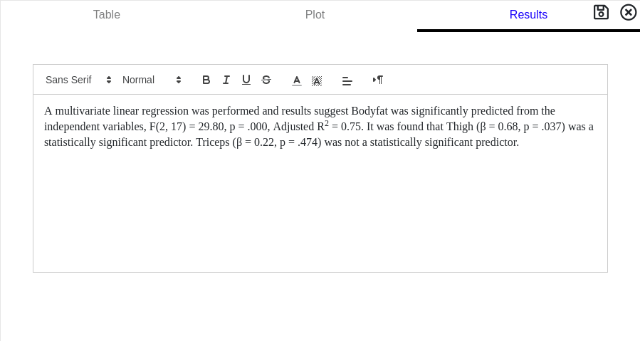
Linear Regression
Regression Coefficient: B
The coefficient associated with the predictor. In the regression equation, this conveys how one unit of change on the predictor changes the dependent variable. i.e. When the predictor increases by 1, the dependent variables changes by B.
95th Percentile Confidence Interval: 95% CI
The confidence interval represents a measure of certainty in regards to the regression coefficient. If the experiment was performed multiple times, over and over, 95% of the measured regression coefficients would fall between the stated values. If the confidence interval contains '0' then the possibility that the measured regression coefficient is due to chance cannot be rejected.
Normalized Regression Coefficient: β
The normalized regression coefficient associated with the predictor. This value is used to assess which predictor has the strongest effect; a larger absolute value indicates a stronger effect.
T-statistic: t
The t-statistic is the regression coefficient, B, divided by the standard error. This number is used in hypothesis tests to determine statistical significance. In regression, the null hypothesis is that the regression coefficient is 0
Probability: p
The probability of measuring the t-statistic given the degrees of freedom. When compared to a critical value, α, statistical significance can be determined.
A p-value greater than the critical value, α, DOES NOT MEAN no effect is present. It means the rejection of no effect cannot be made with any certainty or, alternatively, any effects measured cannot be distinguished from random chance.
R2: R2
R2 is the amount of variance explained in the model without considering the number of predictors used. It falls between 0 and 1 inclusive with values near 0 indicating the independent variables are poor predictors of the dependent variable. Values closer to 1 indicate the independent variables are strongly predicting the dependent variable.
Adjusted R2: Adjusted R2
Adjusted R2 is similar to R2 but accounts for the number of predictors used. It falls between 0 and 1 inclusive, though sometimes it may report a negative value. A negative value is equivalent to 0 when interpreting.
F-statistic: F
In regression analysis, the F-statistic tests the null hypothesis that all the predictors have a regression coefficient of 0. This is useful when comparing models with varying number of predictors.
Probability: p
The probability that the above F-statistic is measured by chance. When compared to a critical value, α, statistical significance can be determined.
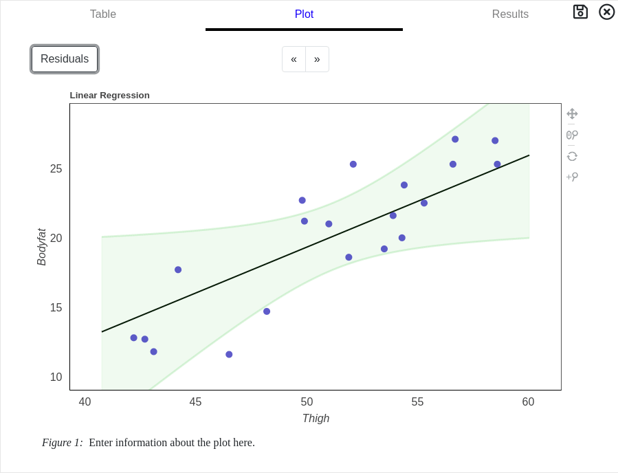
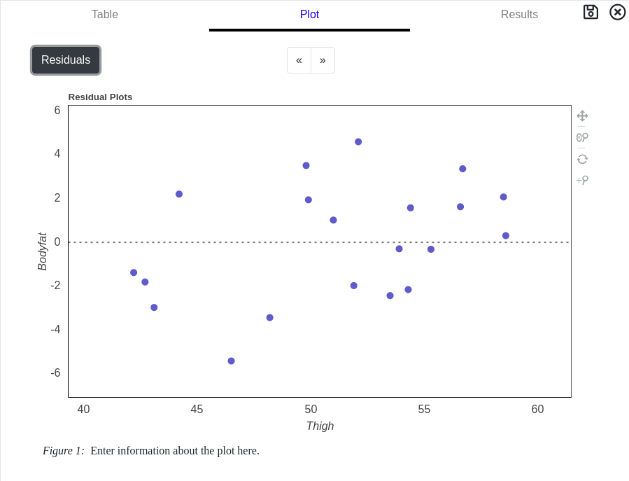
Linear Regression Graphs
Two graphical representations for Regression are available when the Plot tab is selected from the results card.
The default graph is a plot of the dependent variable against the independent variable with the best fit line overlaid on top of the data points. The 95th percentile confidence interval for the best fit line is also shown in green.
If the dataset has more than 500 cases, a random sampling of 500 cases from the dataset is plotted for performance reasons.
Pressing the Residual button changes the graph to show differences between the dataset and the best fit line. This is useful to determine if non-linear relationships are present in the data.
Linear Regression Description
A written description of the Linear Regression results are shown when the Results tab is selected from the results card. An editable text box conveys the descriptive and inferential statistics commonly used to write up the results in a paper.
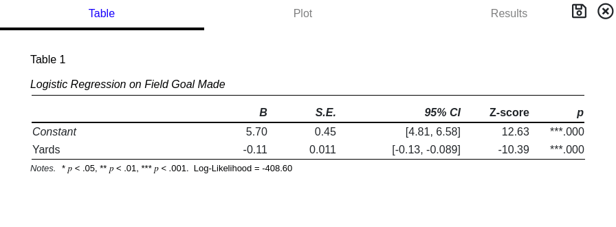
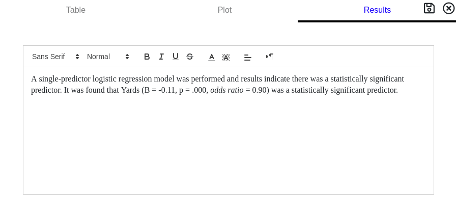
Logistic Regression
Regression Coefficient: B
In logistic regression, regression coefficients are proportional to odds ratios and do not have the same straight-forward interpretation as linear regression.
Standard Error: S.E.
The standard error is the uncertainty in the computed regression coefficient.
95th Percentile Confidence Interval: 95% CI
The confidence interval represents a measure of certainty in regards to the regression coefficient. If the experiment was performed multiple times, over and over, 95% of the measured regression coefficients would fall between the stated values. If the confidence interval contains '0' then the possibility that the measured regression coefficient is due to chance cannot be rejected.
Z-Score: Z-score
The Z-score is the regression coefficient divided by the standard error. The probability associated with this number is used to determine if the null hypothesis, that the regression coefficient is 0, can be rejected.
Probability: p
The probability that the above Z-score is measured by chance. When compared to a critical value, α, statistical significance can be determined.
A p-value greater than the critical value, α, DOES NOT MEAN no effect is present. It means the rejection of no effect cannot be made with any certainty or, alternatively, any effects measured cannot be distinguished from random chance.
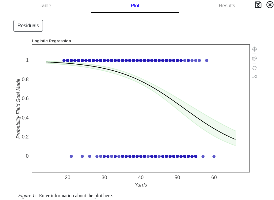
Logistic Regression Graph
Two graphical representations for Regression are available when the Plot tab is selected from the results card.
The default graph is a plot of the probablity of the dependent variable against the independent variable with the best probability line overlaid on top. The 95th percentile confidence intervals are also shown in green.
Logistic Regression Description
A written description of the Logistic Regression results are shown when the Results tab is selected from the results card. An editable text box conveys the descriptive and inferential statistics commonly used to write up the results in a paper.
Factor Analysis
When to Use
Factor Analysis is used to discover unobserved variables that predict the observed measurements. Unobserved variables are sometimes called latent variables or factors and the hypothesis is the number of factors is much less than the number of observed variables. Factor Analysis is very useful when conducting survey research with Likert data.
As an example, imagine asking 1000 people to list their favorite basketball, football and baseball teams. A factor analysis of the results might reveal one large latent variable, namely, the town they grew up in.
How to Run
Press Analyses Button on the Data Analysis page.
Select Factor Analysis from drop down menu.
Select the desired options.
Choose the variables to include in the analysis.
Press the Start Analysis button.
Open the results card to view output.
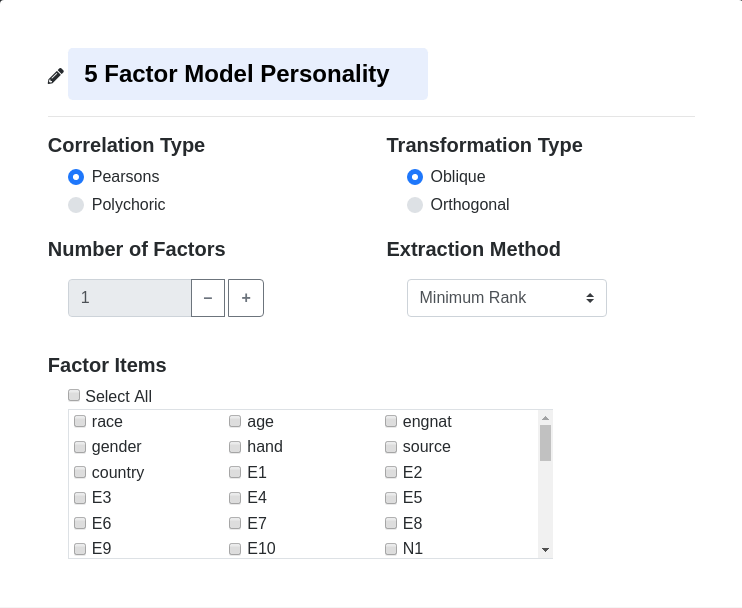
Factor Analysis Options
Correlation Type
Pearsons (default)
Pearson's correlation is the standard correlation coefficient computation. Values range from -1 to 1 inclusive.
Polychoric
Polychoric correlation is a parametric estimation of the correlation coefficient. It is used on Likert data to estimate a 2-dimensional normal distribution to the observed data. Values range from -1 to 1 inclusive.
Transformation Type
Oblique (default)
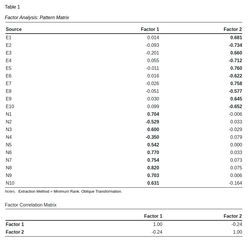
Oblique transformation allows for factor loadings that exhibit the simplest structure. This comes with the cost of correlated factors. When selecting this type, use the pattern matrix to determine factor associations and the structure matrix to assess correlations. This option is only valid when 2 or more factors are extracted.
Orthogonal
Orthogonal transformation forces the factors to remain uncorrelated, resulting in equivalent pattern and structure matrices at the cost of simple structure. "Cross-loadings", questions that load on multiple factors, are indicative of this rotation and clear question-factor associations are hard to discern. This option is only valid when 2 or more factors are extracted
Number of Factors
The number of factors to extract during calculations. If the number of factors are unknown, start with 1 and then look for a 'knee' in the eigenvalue plot from the results card. Data-driven parallel analysis is the prefered method for estimating the number of factors and plans to add this function are under development.
Extraction Method
The extraction method is the underlying algorithm used to estimate the unobserved factors. The advantages and trade-offs between the different methods are beyond the scope of this short introduction but, in general, the differences between them are minimal. The different extraction methods are outlined below.
Principle Component
Principle component is the fastest and least accurate. It is useful when first exploring new data and discovering general trends and/or composition in the data. Principle component method does not estimate unique variances.
Principle Axis Factoring
Principle axis factoring (PAF) starts with the principle component solution then estimates a unique variance for each factor item, resulting in a better estimate of the unobserved factors. PAF may return results which do not afford interpretation, so called Heywood cases, since there are no constraints on valid solutions. Though widely used, PAF isn't recommended.
Minimum Rank (default)
Minimum rank is the slowest but most accurate extraction method. This method maximizes extracted common variance while simultaneously constraining the answer to only valid solutions. Unique variances for each factor item is estimated as well. Minimum rank is the recommended extraction method for use in GoFactr.
Factor Items
Select the variables to be used in estimating the unobserved factors. Clicking the Select All box and unselecting unused items is a faster method when a large amount of items are present.
Interpreting Results
Factors
Pattern Matrix
This matrix represents how the questions under Source contribute to the unobserved factors. An ideal representation would exhibit Simple Structure or, stated alternatively, where each question only loads on a single factor. In general, this matrix does not represent variance estimations but instead can be thought of as a regression equation with loadings representing β weights in a linear regression model. The largest absolute value contributor is in bold.
Structure Matrix
This matrix represents the correlation between the questions under Source and the unobserved factors. When doing an orthogonal transformation, the Pattern and Structure matrices are equivalent.
Un-Rotated Factors
This matrix represents the original, extracted factors before rotation. It is useful for identifying trends in the questions under Source or exploring for sub-factors.
Factor Correlation Matrix
This matrix represents the correlation between the extracted factors. It is important when oblique transformation is selected to ascertain the divergent validity in the model. Large absolute value off-diagonal components suggest low divergent validity. When tranformation type is set to orthogonal, this matrix will only have 1's on the diagonal; uncorrelated factors.
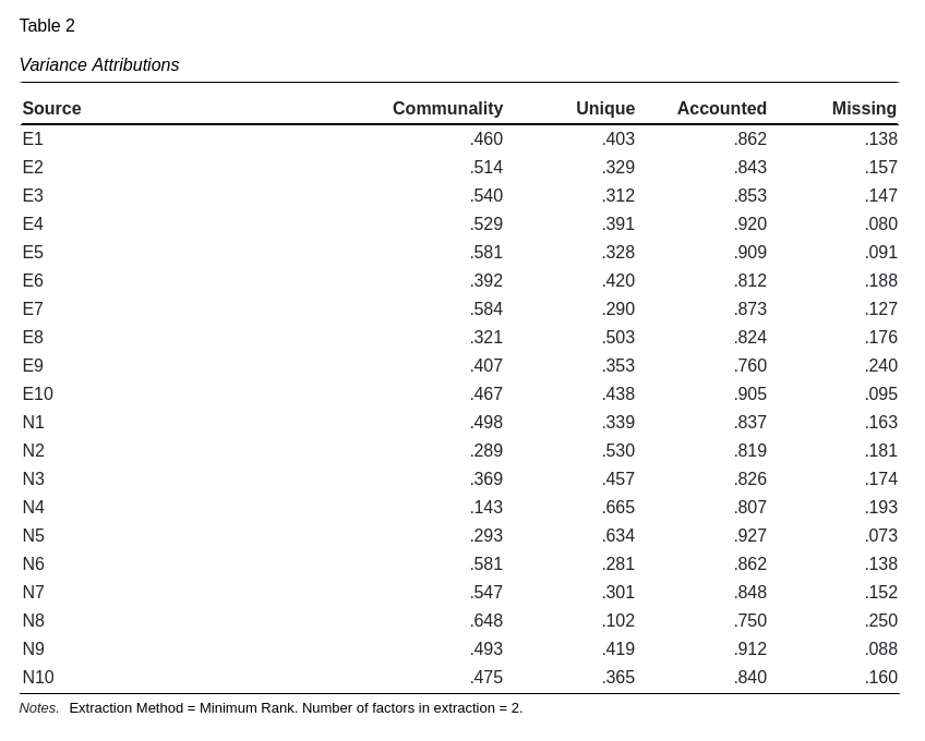
Variance
Communality
The communality is the proportion of variance explained by all the factors. It is equivalent to the squared sum of the un-rotated factors for each source item. Low communalities (< 0.35) are indicative of poor questions and can be considered for deletion or an increase in the number of factors extracted.
Unique
The unique variance is proportion of variance which is specific to the the factor item. High values of unique variance suggest the item may have poor validity. If the extraction method is principle component, then the unique variance is always 0, which helps explain why it is the least accurate extraction method.
Accounted
Accounted variance is the addition of the communality and unique variances. This represents the proportion of variance which has been fully accounted for during the factor analysis extraction. Numbers close to 1 are desirable.
Unaccounted
Unaccounted for variance represents variance which has no discernable source. It is equivalent to 1 minus the accounted variance and is sometimes considered the error variance. If the unaccounted variance is considerable, try increasing the number of extracted factors.
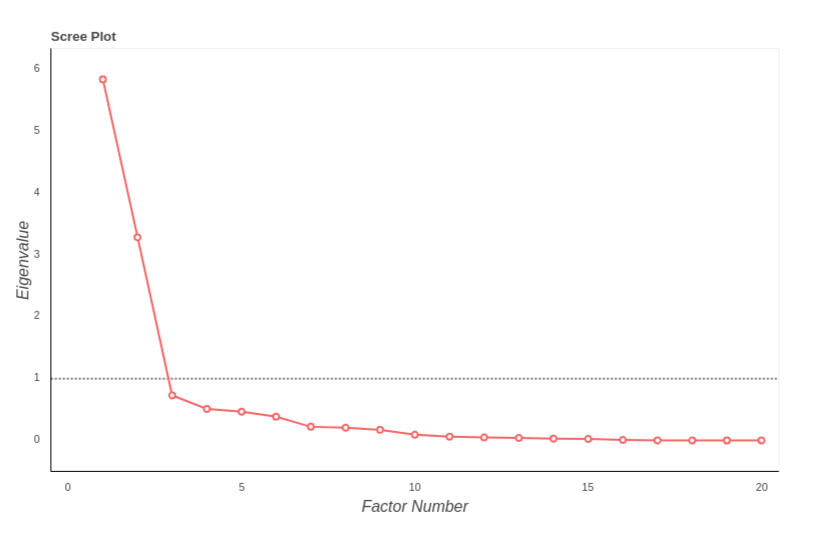
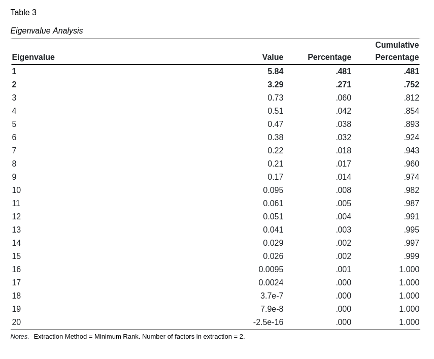
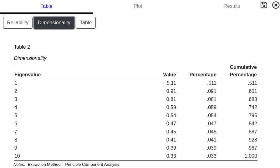
Eigenvalues
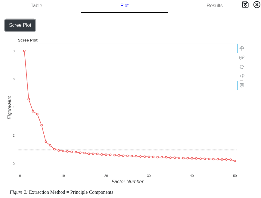
Scree Plot
A scree plot is graphical representation of the extracted eigenvalues. It is useful when determining the number of factors present in the data. The number of factors is approximately where the knee (or bend) in the curve is present. The dashed line indicates the cutoff between eigenvalues greater or less than 1.
Value
This represents the variance attributable to the unobserved factor. These numbers are helpful in determining the number of factors to extract.
Percentage
The proportion of variance, as a percentage, attributable to the unobserved factor. It is desirable to keep only those factors which contribute an appreciable amount of variance.
Cumulative Percentage
The total proportion of variance explained by keeping all the factors up to and including the row. This helps determine if the increase in the number of extracted factors is worth the added model complexity.
Utilities
Utilities includes common methods used in data analysis but are not typically associated with statistical significance testing. These methods are used to visually explore survey data, compute Cronbach's Alpha coefficient of reliablity or to determine dimensionality of constructs. They are located under the Analysis drop down menu for simplicity.
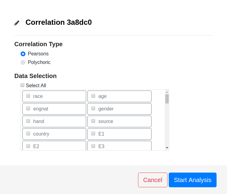
Correlation
When to Use
Correlation is used to assess the relationship between two measurements. Unlike covariance, which has allowable values between 0 and Infinity, the correlation coefficent is bound between -1 and 1. Values near zero indicate the two measurements have no association and are independent. Values near 1 (direct relationship) or -1 (inverse relationship) indicate a strong association between the two measurements.
A correlation coefficient of zero may also be due to a non-linear relationship between the measurements. It's useful to look at a scatter plot to determine if this is the case.
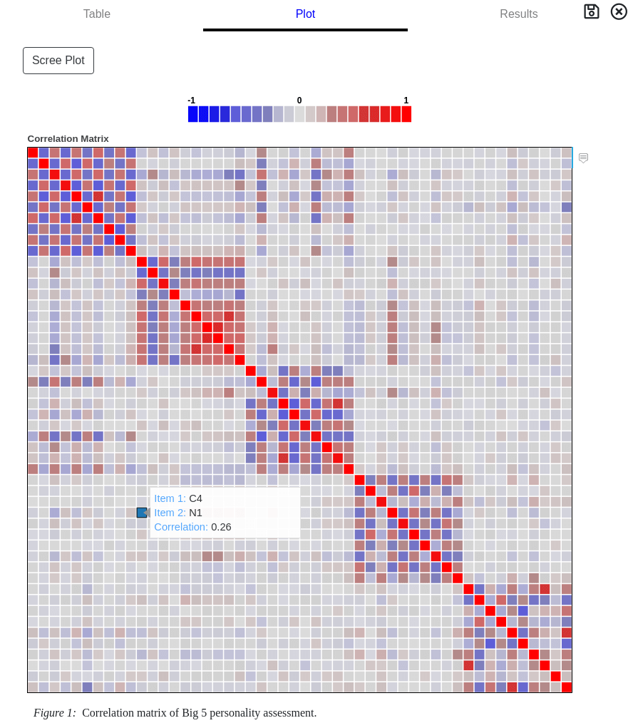
A collection of correlation coefficients is referred to as a correlation matrix. A correlation matrix is useful to determine the relationship between many measurements at once. GoFactr uses a unique interactive visualization algorithm to display this information.
How to Run
Press Analyses Button on the Data Analysis page.
Select Correlation from drop down menu.
Select the desired options.
Choose the variables to include in the analysis.
Press the Start Analysis button.
Open the results card to view output.
Correlation Options
Correlation Type
Pearsons (default)
Pearson's correlation is the standard correlation coefficient computation. Values range from -1 to 1 inclusive.
Polychoric
Polychoric correlation is a parametric estimation of the correlation coefficient. It is used on Likert data to estimate a 2-dimensional normal distribution to the observed data. Values range from -1 to 1 inclusive.
Data Selection
The measurements used in the calculation of correlation coefficients.
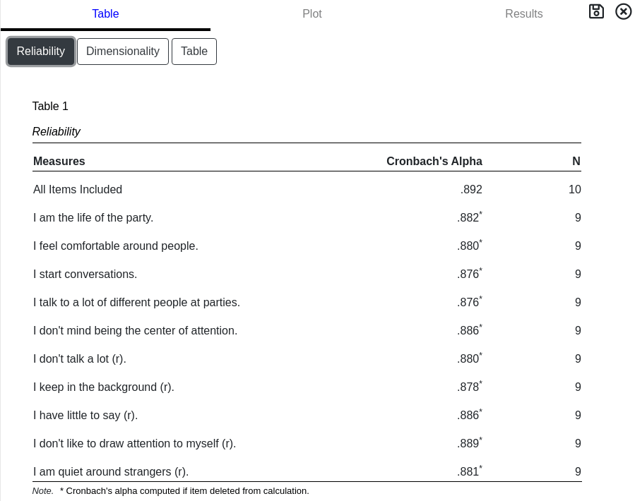
Interpreting Results
Several tables are presented when the Correlation result card is opened. These include tables for reliabilty, dimensionality, and correlation matrices. Several plots are available as well to aid interpretation.
Reliability
Reliability in statistics is an indicator of "related-ness" in measurements. High reliability suggests consistency in the measurements. Low reliability indicates measurements have a high degree of variablity and might be measuring several different factors (multidimensional).
GoFactr tabulates Cronbach's alpha measure of reliablity. This measure indicates the "related-ness" of a set of items used in the correlation calculation. The first row in the table computes the statistic when all items seletected for analysis are included. Subsequent rows compute Chronbach's alpha when the item in the row is not included in the calculation. Use this to identify potential items to exclude in future analysis.
When using Likert data, Cronbach's alpha is only valid when items are first reversed scored.
A general rule for interpreting Cronbach's alpha is a higher number is better. However, a number extremely close to 1 may indicate a lack of separability in items. Common guidelines for interpreting the value of Cronbach's alpha are tabulated below.
Indicator
Alpha
Excellent
> 0.9
Good
0.8 - 0.9
Acceptable
0.7 - 0.8
Questionable
0.6 - 0.7
Poor
0.5 - 0.6
Unacceptable
< 0.5
Dimensionality
Estimate the dimensionality of the dataset by analyzing the eigenvalues and cumulative percentages. For reliablity estimates and scale construction, it is ideal to have only 1 large eigenvalue.
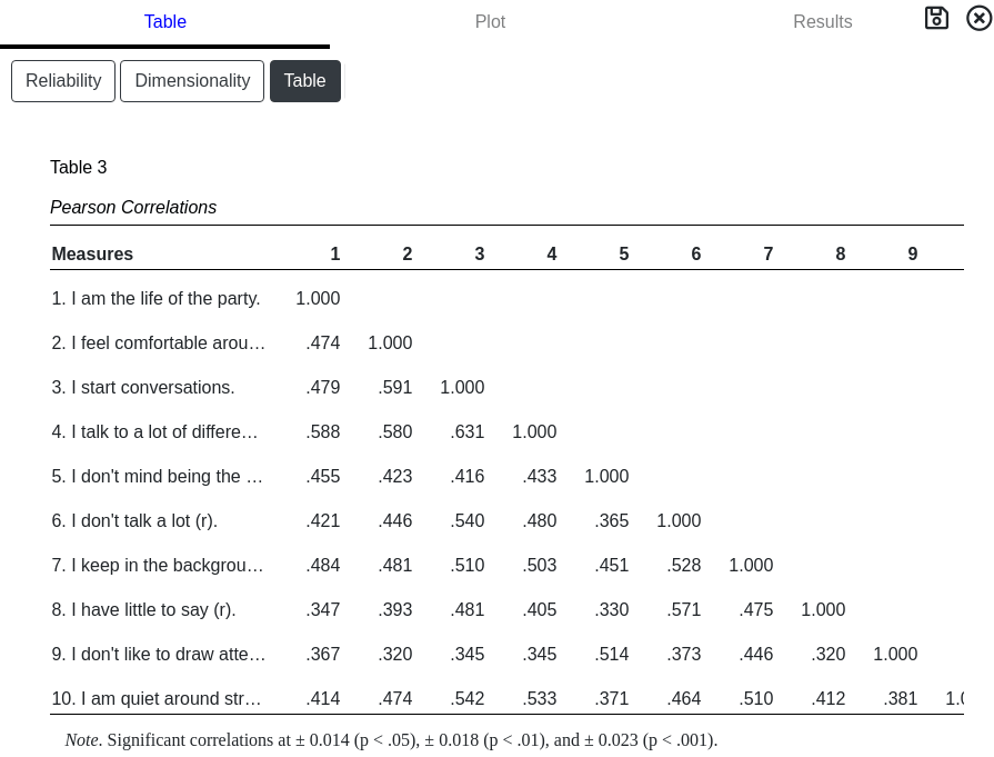
Table
A tabulation of the correlation matrix is displayed for completion. Statistically significant critical correlation values are presented in the notes. This is useful for presentation in a paper but for a large number of items can be difficult to analyze. GoFactr recommends looking at the graphical plots to identify trends.
Correlation Graphs
Two graphical representations for Correlation are available when the Plot tab is selected from the results card.
The correlation matrix graph color codes the paired correlations for easy and quick visual inspection. A legend indicating the color interpretation is at the top for convenience. Moving the mouse pointer over a box will display the two items used and the correlation value between them.
A scree plot is a visual plot of the eigenvalues to aid in determining the dimensionality of the dataset. The "knee" in the curve or eigenvalues greater than 1 are some heuristic methods used when determining dimensionality.